
CASE STUDYBringing a food-focused CIC to life with a kid-friendly brand identity

The Details
Client:
Weans’ Scran + Kitchin
Project:
Weans’ Scran + Kitchin Brand Identity
Services:
Logo + colour palette design
Deliverables:
Logo suite, colour palette + brand stylesheet
Weans' Scran + Kitchin runs cookery workshops for kids — teaching them to make healthy, environmentally friendly food, and more importantly, to actually want to eat it. Getting children involved in cooking is one of the most effective ways to get them excited about what goes on their plate. It's a simple idea with a lasting impact.
They came to me with no visual identity and a plan to expand — kids' workshops now, adult courses in the future. The logo needed to work for both.
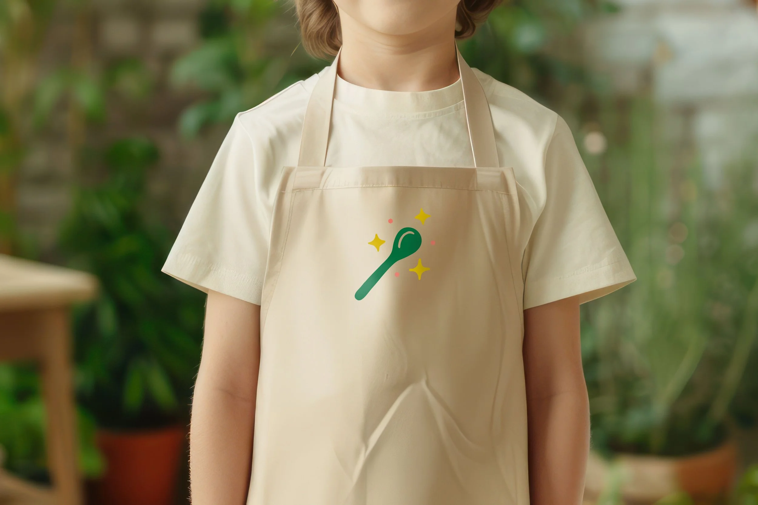
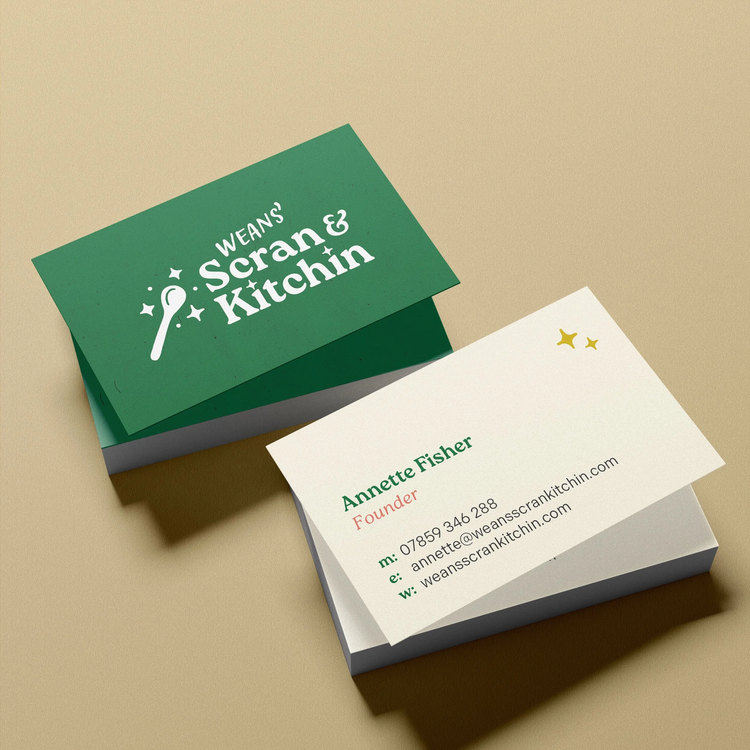
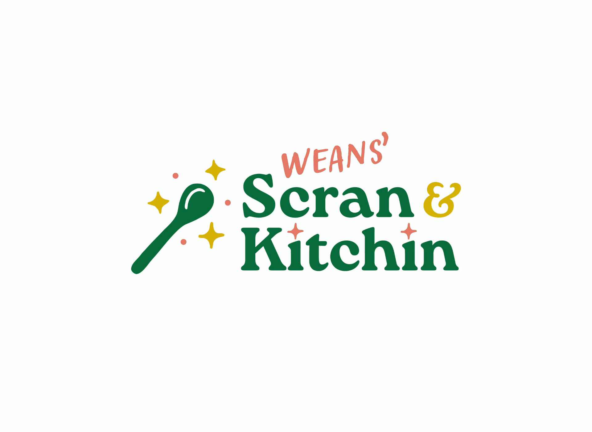
My solution was to make Weans' a hand-scribbled addition to the main logo — a touch of whimsy that could be removed entirely as the brand grows, without rebuilding anything from scratch. One logo, two versions, room to evolve.
The result is warm, friendly and a little bit playful — a brand that speaks to kids without alienating the adults who are booking the classes. At their launch night, the founder called me out by name in her speech. That doesn't happen very often, and it meant a lot.
"The work Laura has produced is incredible. I've had so many people positively comment on the look of the magazine, and the truly professional feel."
— Rhiannon Davies, Founder, Greater Govanhill